ProBlogger: The 9 Conversion Habits of the World’s Most Successful Bloggers | |
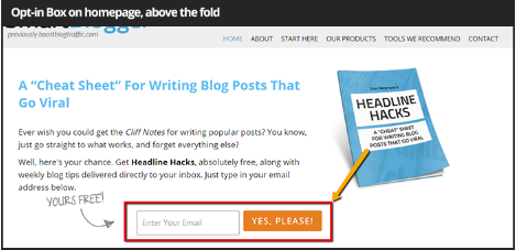
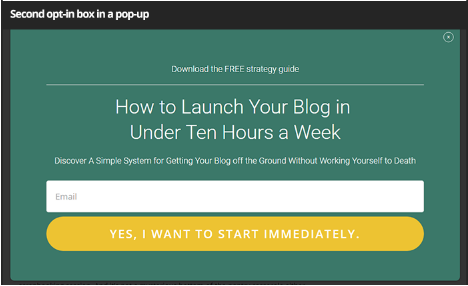
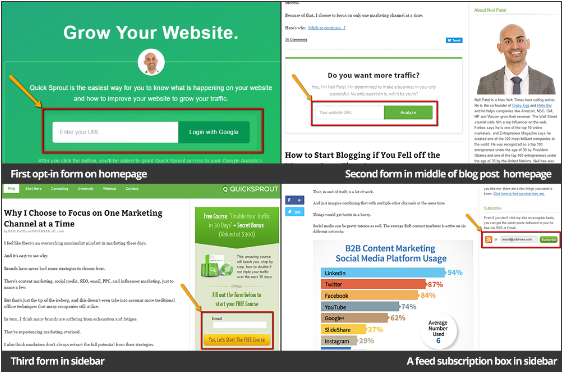
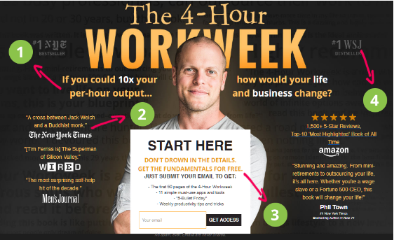
| The 9 Conversion Habits of the World’s Most Successful Bloggers Posted: 26 Apr 2017 07:00 AM PDT This is a guest contribution from John Stevens. Just how do they do it? From influencing millions to making millions, the world's most successful bloggers manage to turn visitors into readers, readers into customers, and customers into fans without breaking a sweat. But is it all accidental, or is there any science behind their success? Are there any habits successful bloggers follow? And if they do, what are they and why do they work? In this post, I'll give you answers to these questions, and more. 1. They use multiple opt-in boxesAccording to research by ExactTarget: "77% of consumers prefer to receive permission-based marketing communications through email". With email being such an effective method of conversion, top bloggers make sure they don't leave any stone unturned in order to get visitors' emails. Using more than one opt-in box increases the chances of users signing up with you. But there is also a fine line before it gets annoying. For example, Smartblogger keeps it very subtle. Jon Morrow asks for your email on the homepage and a popup when you're about to leave the website. This treads the fine line between "effective" and "annoying". Since SmartBlogger is a writing-focused blog, the reduced visual clutter also fits its audience and brand image perfectly. Neil Patel uses multiple opt-in boxes at QuickSprout – on the homepage, sidebar, as a popup and at the end of every blogpost. Some may argue he goes a little overboard but since Neil writes about marketing, his audience is likely forgiving of aggressive marketing tactics. While you can debate merits and demerits of an aggressive opt-in box strategy, one thing is clear: they work. Doing it too aggressively in a non-commercial niche might not be the best option, but at the very least, you should have 1-2 opt-in boxes throughout your site. What you can learn from this: Use more than one opt-in box on your site. Take advantage of pop-ups and above the fold area (see below) to maximize visibility for your opt-in boxes. 2. They make good use of "above the fold" area"Above the fold" is the first half of a webpage that is visible without scrolling. Whatever content you place above the fold is the first thing your visitors will see when they land on that page. If it is irrelevant, there is good chance they will leave the site before exploring further. As Peep Laja of ConversionXL writes, "Content placed above the fold grabs our 80% of attention". Plenty of studies back this claim. According to an eye-tracking study by the Jakob Nielsen group, viewer attention drops dramatically beyond the fold. Top bloggers understand this, which is why they use their above the fold area to introduce themselves to their audience, collect emails and put forth evidence of their success (such as reviews from other sites). Tim Ferriss' site Four-Hour-Workweek is a great example of this. There's lots of good stuff happening here. Let's drill down:
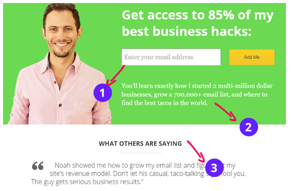
Also note how Tim uses his own face rather than a generic brand image. Here's another example from Noah Kagan, founder of OkDork: Though not as busy as Tim's homepage, it still follows the same principles:
What you can learn from this: Two things:
3. They make it easy to share contentSharing might sound intuitive to us marketers and bloggers, but your average reader might never share your content unless you make it seamlessly easy to do so. This is partly due to laziness – your readers don't want to put in the effort to copy-paste URLs or think of tweets. Partly, this is because your readers don't even know how to share content. In fact, a recent survey of computer users across 33 rich countries showed that only 5% of the population could do complex computer tasks, while 14% are "below level 1". Successful bloggers understand this very well. That is why they provide multiple easy options for readers to share content anytime they want. For example, GrowthEverywhere uses multiple social sharing options on the side bar: This allows readers to pick their favorite social media channel and share the article with one click. Another tactic is to use plugins such as Click to tweet to get more shares from Twitter. This takes all the effort out of sharing on Twitter – readers can, well, click to tweet the highlighted text. Here's how Tim Soulo uses it on BloggerJet: But simply flooding your posts with share buttons isn't enough. Hick's Law dictates that after a certain point, more choices simply confuses your users and discourages action. To solve this problem, limit your sharing buttons to your top 2-4 networks. If you don't have a lot of visual content, it doesn't make sense to throw in Pinterest, Instagram and Tumblr sharing buttons. For example, Neil Patel uses just two social networks – Facebook and Twitter – on Quicksprout. What you can learn from this:
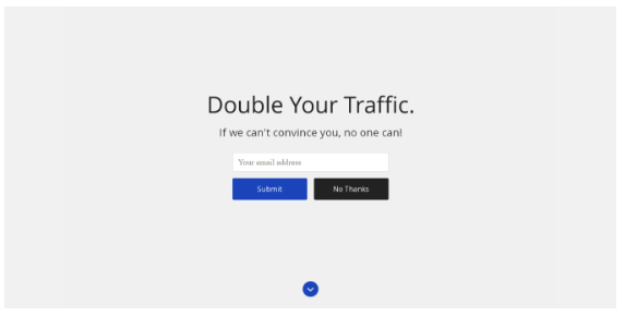
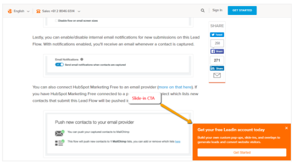
4. They use overlays to capture additional emailsEmail is the foundation of blogging success. Which is why bloggers keep coming up with innovative ways to capture more and more emails. One such technique is called 'welcome mats'. Welcome mat displays a full-screen call to action that shows when visitors land on your website. For example, this is how the welcome mat looks like when you visit Zac Johnson's site. As you scroll down, the welcome mat goes up and you are presented with the landing page. SumoMe takes this a step further and uses custom welcome mats for each blog posts. A post about writing better headlines, for instance, shows this welcome mat: Another popular overlay is to use a Slide-in CTA. This CTA enters the screen below your sidebar content so it doesn't cover your main content: Here is how Hubspot uses it: What you can learn from this
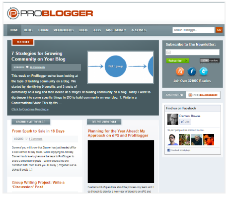
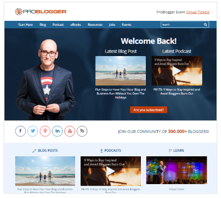
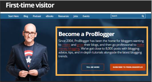
5. They use static home pages to funnel additional leadsIf you went back in time and visited ProBlogger.net back in 2013, this is what you'd see: In contrast, ProBlogger's homepage today looks very different. What changed? For one, ProBlogger's new homepage doesn't just show the latest posts. Instead, it pushes PB's latest content, directs users to relevant categories ("I need help with…") and also includes a prominent email capture form. This is a tactic a growing number of bloggers are adopting. Instead of directing users straight to the blog, they direct them to a homepage instead. Here, they can introduce themselves to their readers, direct them to their best content and capture emails. For example, here's Videofruit: This also gives bloggers an opportunity to do some personalization. For example, on ProBlogger, returning users are greeted with a "Welcome Back!" message while first-time visitors get links to introductory content. What you can learn from this Create a homepage instead of directing users straight to your latest blog posts. This gives you an opportunity to do so much more than just make them read your latest content. 6. They use social proof to build trust and authorityAs per wikipedia: "Social proof is a psychological phenomenon where people assume the actions of others in an attempt to reflect correct behaviour for a given situation." In a nutshell, we look at other's opinions and signals to evaluate our own potential action. Consider that:
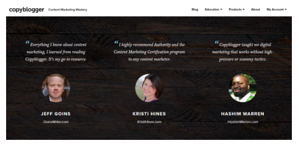
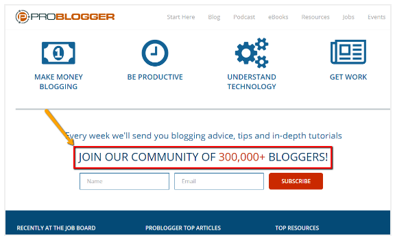
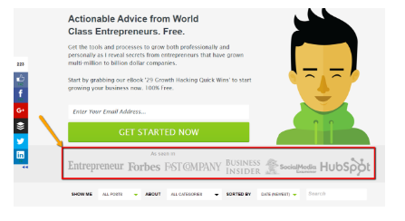
Top bloggers take advantage of social proof in a number of ways: By showing testimonials This is perhaps the most common use of social proof that most (if not all) bloggers use. According to the research done by Nielsen, "92% people trust a recommendation from a peer and 70% people will trust the recommendation from someone they don't even know". For example, Copy Blogger shows testimonials from real people on their homepage. By showing authority endorsement Brian Dean from Backlinko uses testimonials from the big names in the marketing industry. This is an example of the principle of authority where you leverage the authority of successful people to make yourself appear more trustworthy. By showing the number of subscribers For example, on Problogger's homepage you'll see this: 300,000 bloggers can't be wrong, right? By showing that so many people have joined the community, ProBlogger shows that it is trusted by your peers. By showing media mentions This is another example of the principle of authority in practice. By showing that you've been featured in authoritative publications, you increase your own perceived authority as an expert. For example, consider Growtheverywhere's media mentions: What you can learn from this: Social proof can be hard to use if you don't already have it. Showing off your subscriber count when you have just 300 subscribers isn't very comforting. To get around this problem, try to get featured in prominent publications or get interviewed by other bloggers. You can then use the logos from these publications or quotes from others about you as social proof. 7. They use a "Start Here" page.SmartBlogger does it. SmartPassiveIncome does it. Even ProBlogger does it. I'm talking about a "Start Here" page. As you can imagine, this is the "start" page for your blog, a page that tells readers who you are, what you blog about, and what they should read. ProBlogger's start here page, for instance, tells Darren's story and shares a list of resources with readers. Readers will often turn to the "Start Here" page when they land on your site for the first time. While you might have a detailed homepage, it can't tell your story quite as effectively as a compelling "start" page. It's also a fantastic opportunity to collect emails and increase conversions. What you can learn from this Easy: create a start page for your blog. This page should:
Once you've created this page, make it the first link in your navigation menu. 8. They make better use of the footer areaThe footer area is often overlooked when designing blogs for conversion. We're so fixated on the above the fold area that we completely forget about users who scroll all the way to the bottom (who, ironically, are also among your most engaged users). The truth is that the footer matters even more than your middle 'body' content. I'll refer back to Nielsen group's scrolling behavior study: Notice how attention spikes right at the end of the page? Successful bloggers understand this, which is why they use their footers to increase engagement and conversions. For example, ProBlogger directs its readers to different resources on its site: On Hosting Facts, you'll see a three-column layout (like above) highlighting:
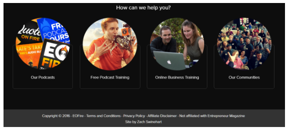
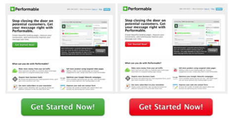
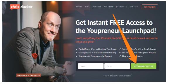
You can also use the footer area to show users all your content and product offerings. On Entrepreneur On Fire, for instance, John Lee Dumas shows all of EOFire's offerings (trainings, podcasts and communities) in the footer of his blog content: Since anyone who has reached the footer is likely already familiar with your content, directing them to high converting pages is a smart move. This is where you can make some additional conversions. What you can learn from this Take a close look at your footer and ask yourself: are you making the best possible use of this screen real estate? If the answer is no, think of the links you can add here. Your best content (in terms of engagement and/or revenue) should get prime space in the footer, as well as your lead-gen forms, earnings disclaimer, and contact details. 9. They use prominent CTAsWhat color CTAs do you use? I know this might sound like a minor design quibble, but your CTAs have a big impact on your conversion rates. For example, in one case study, changing the color from green to red increased conversion rates by 21%. This might not sound a lot, but if you get 100 customers each month for a $100 product, you'll make an extra $2,100 – with no extra work. In the above example, the red button worked because it contrasted against the green of the logo. The green button, on the other hand, seemed to merge with the text. Most successful bloggers follow this practice and make their CTAs very prominent. For example, on Chris Ducker's site, you'll see a green CTA standing out against the orange text. It's the same on James Clear's homepage – you see a green button standing out against a grey-white background. There is actually a scientific reason why contrasting colors work so well in CTAs – the Von Restorff effect. Also called the "isolation effect", this principle states that when confronted with multiple stimuli (in our case, CTAs), the stimuli that stand out the most wins our attention.
What you can learn from this Since your CTAs lead visitors to subscribe to your newsletter, download your eBooks or buy your courses, it makes sense to optimize it for higher CTR. Try testing colors that stand out against your site background in your CTAs. The more prominent, the better. Over to You Building a high-converting blog isn't a matter of chance; it is deliberately planned. While your content creation and distribution strategy will largely define your success, you can increase conversions dramatically by following the same tactics as the world's best bloggers. Start off with the 9 habits highlighted above. Once you've used them, share your results with me in the comments below! John Stevens is the CEO of Hosting Facts, a startup that helps consumers make data-backed decisions when choosing web hosts. He is also a frequent contributor to WebsiteSetup where he helps businesses set up their website. The post The 9 Conversion Habits of the World’s Most Successful Bloggers appeared first on ProBlogger. |
| You are subscribed to email updates from ProBlogger. To stop receiving these emails, you may unsubscribe now. | Email delivery powered by Google |
| Google Inc., 1600 Amphitheatre Parkway, Mountain View, CA 94043, United States | |

