ProBlogger: 7 Key Design Elements for a Mobile Landing Page that Converts | |
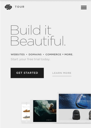
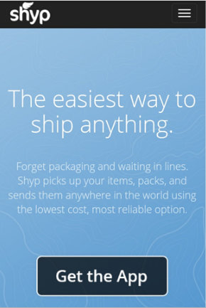
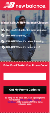
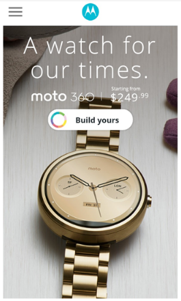
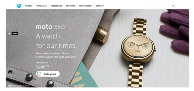
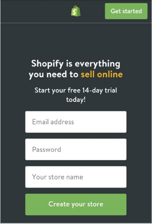
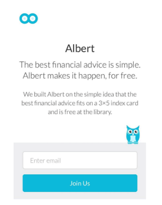
| 7 Key Design Elements for a Mobile Landing Page that Converts Posted: 20 Jun 2017 07:00 AM PDT This is a guest contribution from Shane Barker. If you've been blogging for awhile, you're probably familiar with landing pages, and may have even used a few of them for different campaigns. Whether you're trying to drive people to sign up for your mailing list, or to purchase a product/service you're promoting, landing pages can help you achieve your conversion goals. But is your landing page optimized for mobile users? Is it able to drive enough conversions on mobile? Just imagine you're using your smartphone to read someone else's blog, and you click on a link to learn about a certain product reviewed in the post. But you end up on a page that is too difficult to view and navigate. You have to either squint, or zoom in to read the page content. That could ruin your experience, and may even compel you to leave the page. The result? For the blogger, it means they've lost the opportunity to convert you. Don't make the same mistake. When you're designing a landing page, make sure you optimize it for mobile users. The seven key design elements below can help you design a mobile landing page optimized for conversions. 1. A Short But Strong HeadlineLanding page headlines should always be clear and concise. For a mobile landing page, your headline has to be even shorter, because you have even less space to work with. Use no more than five words, and describe what your website is about, or what your product does. This may be difficult, but it isn't impossible. Take a look at the Squarespace mobile landing page, for instance. The headline, "Build it Beautiful," is short, but it clearly tells people what the product is about – building websites. And "beautiful" highlights the benefit of using the platform. They've perfectly summed up what their product does, and what makes it special, in just three words, with a compelling headline. Try to form your headline around the main features and/or benefits of your product. Maybe it will help readers learn something useful, or tackle a challenge they've been facing. Once you come up with a potential headline, check it several times to see if you can shorten it and still keep it compelling. For instance, you could shorten, "Convert People with Beautiful Landing Pages," to, "Create Landing Pages that Convert." Although many landing pages have a subheading with more details about the product's features, that may not be the best option for a mobile landing page due to the limited space. You can try adding a few bullet points if you absolutely have to include further details or benefits of the product. Just make sure each point is concise and clear. 2. A Short And Persuasive Call-To-ActionYou know the importance of persuasive CTA copy, and how it can help drive conversions. With mobile landing pages, your CTA copy needs to compel users to take action, and it needs to do so with just 2-3 words. Something like, "Get Started," "Grab Your Deal," or "Build Your Website," may be ideal as they get straight to the point in just a few words. For example, the mobile landing page for the Shyp app has clear call-to-action copy that urges people to, "Get the App." To come up with compelling copy for your CTA, first define the goal of your landing page. Is it to get people to enter a contest, download an eBook, or sign up for your mailing list? Next, write a short CTA that clearly tells people what you want them to do, like, "Enter to Win," or "Download Your Guide." 3. One Prominent CTA ButtonWhat's the goal of a landing page? To get people to do something. So what's the point of having a CTA button on your mobile landing page if it's barely visible? If you're trying to get people to take a certain action, make sure the CTA button is prominently displayed. If possible, choose a button color that contrasts with the main page color so that it stands out. While aesthetics are a crucial part of your landing page design, you shouldn't blend the elements so much that you hide the CTA button. The New Balance mobile landing page below highlights one CTA button boldly in black. And you can see that, although the button clearly contrasts with the rest of the page design, it doesn't compromise the overall aesthetics. The optimal number of CTA buttons on a mobile landing page is one, because you want to direct users towards one particular action. You don't want to confuse them with too many options. If you have several goals, you can try building a separate landing page for each goal. But if you absolutely must have more than one CTA button on a page, make sure you highlight the main call-to-action, and blend in the others with the rest of the design. For instance, if the goal is to get people to download something, the CTA button for downloading should be the most prominent. Secondary CTA buttons like, "Learn More," or "Contact Us," should be less visible. A good example is the Squarespace landing page shown above, where the main call-to-action, "Get Started," is more prominent than the secondary CTA, "Learn More." 4. Minimal ClutterWhen you're targeting mobile users, you should keep in mind that there is limited screen space to work with. A busy page design with too many elements can be an eyesore, especially on mobile landing pages. You need to simplify the page design as much as possible. This means you need to remove any unnecessary clutter, and keep other elements hidden if possible. Keep only the most important elements. Just take a look at the simplistic and elegant landing page for Moto 360, for example. The page contains only a few elements: a strong headline, the product name, pricing info, and a call-to-action button. Now let's take a look at the original desktop version of the landing page. Here, there are a few changes in the formatting. Although the headline remains the same, this version has a small subheading to describe the product. You can also see that the navigation bar isn't hidden like in the mobile version. For mobile, keep only the most important elements, and remove unnecessary elements that may clutter the page. Removing unnecessary clutter from your mobile landing page doesn't just enhance the page's aesthetics, it also reduces the page's load time. A faster loading page can improve user experience, and boost conversions. 5. Simplified FormsDo you really need people to fill in 7 or 8 form fields when signing up for something? Too many form fields can clutter your landing page, and frustrate users. If you want more people to convert, you need to simplify the conversion process. The idea is to get them to complete the task before they have time to change their minds. Simplify your forms – whether they're for subscriptions, free trials, or promo codes. Make sure any forms on your mobile landing page collect only the most crucial information. For example, you probably need a user's email address for eBook downloads, newsletter subscriptions, free trials, promo codes, and pretty much everything else. But you may not need to ask for their name, address, or phone number. Adjust the form fields based on what you want to achieve with the landing page. The Shopify free trial landing page shown below has only three form fields. It asks for an email address, store name, and a password so that users can access their account later. It doesn't ask for any unnecessary information like name, phone number, or address. 6. Readable CopyWhich of these is easier to read: ProBlogger or ProBlogger? Naturally, you'd choose the latter of these two font sizes. The font styles and sizes you choose to use can have a huge impact on the readability of your mobile landing page. Remember, you're working on a small screen; so you need to make sure that your copy is easy to read, despite the small space. The idea is to make sure that people don't have to squint or zoom in to read the content on your landing page. The ideal font size according to Google is 16 px, but you can always customize the size according to the font style you've chosen. Don't forget to leave ample space between text lines to improve readability. If you've followed the tips above, you've already simplified the design, and shortened your headline. That means there will be more space on your mobile landing page, allowing you to use a larger font that's easier to read. Additionally, choose a font color that contrasts with the main color used on the page, but still blends well with the rest of the design. Here's an example from Gumroad. As you can see in the image below, the text is clearly visible. It is easy to read because of the large font size and simple style. It also contrasts with the main page color, while still complimenting the rest of the design. 7. Neatly Organized ElementsIf a mobile landing page has too much going on, the design can easily become an eyesore. Maybe there's too much text, or the headline and description are too close to the CTA button. Unorganized elements can confuse your readers, and negatively affect their experience. For a mobile landing page design that boosts conversions, make sure all elements are neatly organized. There should be a sufficient amount of whitespace between elements so that people can navigate the page easily, and find what they're looking for. This will also improve the visibility of your CTA button. Take a look at the mobile landing page for the Albert app below. There is more text than recommended, but the design still works well because the elements are neatly organized. Sufficient whitespace separates the headline, subheading, and CTA button, preventing the design from looking cluttered. The blue CTA button is prominent amidst all of the text and whitespace. What's Next?Once you've optimized your mobile landing page with the seven design elements above, you need to check whether or not they're working for you. A few minor tweaks may be necessary to maximize their effectiveness. Make sure you run A/B tests for every element, and make adjustments, or changes as needed. The goal is to ensure that your page:
All of these play a role in how well you're able to convert an audience. Run an A/B test or a multivariate test for each element to find which areas need further improvement, and which changes are working for you. Do some call-to-actions or headlines work better than others? Which color combination drives more conversions? Experiment with different colors for your CTA button to determine which one gets the most clicks. Test several headlines to find out which your audience responds better to. Experiment with different font styles, and sizes and check if there's any difference in your conversion rate based on those changes. ConclusionNow you know the key elements you need to use to design a high-converting mobile landing page. Have you tried any of these tips before? How did it affect your conversion rate? Do you have any questions about mobile landing pages? Feel free to share your thoughts in the comments. And if you need any help optimizing your website, blog, or landing pages for conversions, you can get in touch with me. I can help you come up with the best solutions for boosting your conversions. Shane Barker is a digital marketing consultant that specializes in sales funnels, targeted traffic and website conversions. He has consulted with Fortune 500 companies, Influencers with digital products, and a number of A-List celebrities. You can find him on Twitter here. The post 7 Key Design Elements for a Mobile Landing Page that Converts appeared first on ProBlogger. |
| You are subscribed to email updates from ProBlogger. To stop receiving these emails, you may unsubscribe now. | Email delivery powered by Google |
| Google Inc., 1600 Amphitheatre Parkway, Mountain View, CA 94043, United States | |


0 comments:
Post a Comment