“8 Strategic Blog Home Pages that Draw Readers Deeper” plus 1 more |  |
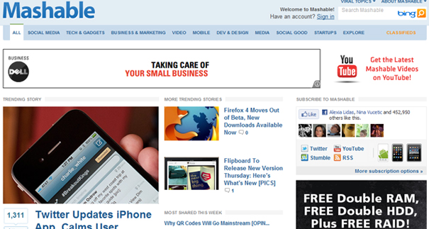
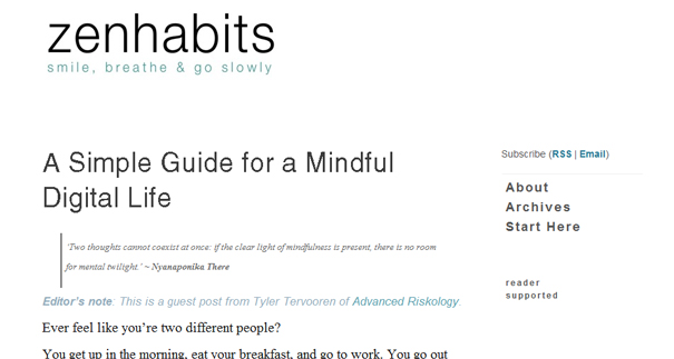
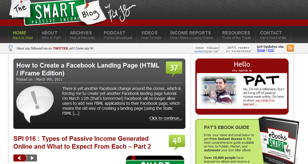
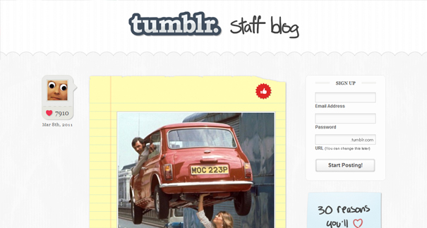
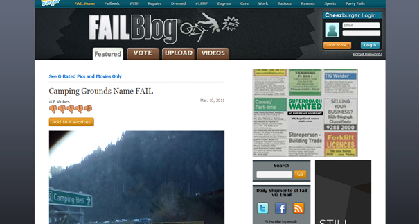
| 8 Strategic Blog Home Pages that Draw Readers Deeper Posted: 29 Mar 2011 12:04 PM PDT This guest post is by The Blog Tyrant. One of the hardest tasks a blogger can face is getting readers to stick around. In actual fact, its one of the most important things you’ll ever learn to do. Why? Because unless those visitors delve deeper into your site you are essentially wasting your time with all that amazing content, social media effort, and SEO work. Bloggers often forget that we need to use things like design, layout, colors, format, and so on to help visitors delve further in to our sites. In this post I’m going to show you eight blog home pages that make readers click deeper. Hopefully it will give you some ideas for your own. 8 Home pages that draw readers deeperI wanted to start off by letting you know that each of these pages was chosen for a different reason. Now, I’m not saying that these are the best blog home pages in the world. What I am saying is that each one does something extremely well that encourages new visitors to become more loyal readers. 1. MashableMashable is one of the world’s biggest blogs and has a massively high page views. The main reason they are able to do this is through social proofed elements of their layout. Let me explain. Social proof is where you provide some kind of assurance that other people have used your service. Testimonials, for example, are a common form of social proof. These things reduce anxiety in the reader but also serve to encourage a group mentality whereby people want to be involved in what other people are doing. It’s just human nature. Mashable is all about social media and you see items like the “most shared this week” and the number of Facebook “likes” featuring prominently. The “buzz” this creates gets people to go deeper in to the site—people want to read articles that hundreds of others found interesting. 2. Digital Photography SchoolDigital Photography School is Old Man Rowse’s biggest blog. It has hundreds of thousands of subscribers and is one of the most heavily community-based blogs you’ll ever read. The activity in the comments and the forums is really quite wonderful. I remember when Darren first released the new DPS design; I was blown away by how efficient and enticing it was. The old site was a straight up one column blog but this is a multi-level blog that divides the areas up by different sections of interest. Want to read about photography? Just go to that section. Want to read about equipment? Go over there. This is a fantastic way to ensure photographers find areas of interest at the home page. It gives very little room for people to get bored and move on. 3. Huffington PostHuffington Post. The blog turned worldwide news source. Sigh. Whatever you might say about the quality of the news that comes out of the site, the layout is extremely captivating. And it’s not because it’s pretty. Here is an example of a site on which the visuals aren’t necessarily pleasing, but they are very effective. The area of the home page above the fold is dedicated to the most shocking current story as well as a pop up bar that asks you to get involved. It also uses a series of highly placed headers to show you what news is trending at the moment. Again, this is done to capitalize on people’s need to know what other people are interested in. Scroll further down the home page and you see more engaging items like author profile photos to build loyalty, huge comment counts on featured articles and a mix of featured articles from different topics. 4. Zen HabitsLeo from Zen Habits is one of the nicest guys in the world. A few years ago he gave me some free advertising space and helped me launch a new blog. His new design is totally minimal and fits in extremely well with the branding of the site. Lots of space. This type of strategy works extremely well for a blog with amazing content. Why? Because it is entirely focused on that content. You read that first amazing article and you feel compelled to delve deeper. This is a brave design that takes a lot of courage because if each and every post that appears on the homepage is not amazing, you will see a lot of people drop off. 5. Smart Passive IncomeSpeaking of nice guys, Pat from Smart Passive Income is one of the nicest. Recently when I was setting up my podcasts he gave me a lot of time-saving tips. And that is a big theme in Pat’s design: help. See the top level of menu items? Each one has a sub heading that gives you more information about what to expect inside. I remember the first time I visited Pat’s site, I spent ages clicking through each menu item to browse the contents. That is something I don’t normally do. The navigation is extremely “sticky”. Similarly, there is a little space below the menu where Pat gives little random messages or tips. This takes the “tutorial” vibe of his site even further and definitely makes the experience feel more personal and intimate. 6. TumblrThe guys at Tumblr are extremely good at design. In my article on the 12 Best About Us Pages I confessed that I thought theirs was the best one of the lot. And while the blog homepage isn’t right up to that standard, it is still worth a look. The reason I included Tumblr in this list is because they use simple graphical elements to draw the eye down. Each post is very simple and usually only includes a picture or a bit of text. And each alternating post has a different background. Mixed with the fact that the emphasis is on showing which staff member wrote each post and you have an extremely addictive blog home page. 7. Fail BlogFail Blog, in case you have been living under a rock, is part of the LOL Cat empire. These guys build sites with funny pictures of cats and dogs and people getting hurt and make a small (read: large) fortune out of it. Again, the homepage design is not beautiful, but it is extremely addictive. You can navigate through all their sites from the top as well as getting in on the action by voting for the best fails. They also have a little “random fail” generator, which is the kind of gimmick people on this site love to use to waste more of their day. One of the cleverest ideas here is the fact that every can have a go at re-captioning the fails. This builds on the community in a massive way by getting everyone interacting with each fail multiple times. People write new captions and then come back to see what other people are saying about it. 8. The OnionThe Onion is quite literally one of the funniest websites on the Internet. And aside from hilarious content, great titles, and a home page that lets you see a plethora of content all at once, one thing they do really well is have an interactive and changing header that gives you access to new information. Normally blogs just have a static header but this one moves and changes based on what’s going on at the blog. Sure, they still have the same logo and colors to keep the branding recognizable but they also use the variation to get people involved in new areas. Very clever. Lessons to apply to your own blogSo what are the take-aways from these eight blogs home pages? What are some concrete things you can apply to your own blog today to increase the amount of pages people view?
As I mentioned in the post about the best about us pages, it is a really good idea to occasionally take a look at what the big guys in the industry are doing. Quite often they are doing it for a reason. The most important thing, however, is to make sure you don’t leave it as an idea but apply it to your own blog right away. What draws you in?I’d like to open up the floor now and find out what parts of a website’s home page draw you in deeper? Is it something to do with the layout, the content, the colors—or something totally different? Please leave a comment and let me know. The Blog Tyrant hasn’t revealed his name yet but we know that he is a 25-year-old guy from Australia who works from home and has sold several blogs for around the $20,000 mark. Now he’s teaching you how to dominate your blog. Subscribe by email to get his free eBook on capturing 120% more email subscribers overnight or follow him on Facebook. Post from: ProBlogger Blog Tips 8 Strategic Blog Home Pages that Draw Readers Deeper |
| The Unsexy Truth about Finding Traffic for Your Blog Posted: 29 Mar 2011 06:05 AM PDT Last week I tweeted that I’d not checked my Google Reader account in a month. Well, it turns out that I’m not the only one. Within minutes, I started getting tweets back from others saying that they rarely check their RSS feeds any more. Instead, people were finding content from other sources including:
The decline of RSS?It struck me just how much things have changed over the last two or three years. It wasn’t long ago that bloggers were promoting their RSS feeds above all other methods of subscribing to their blogs. Email was dead and RSS was going to be the number one way that people would connect with you. RSS does continue to drive traffic (at least, my Feedburner stats seem to indicate that) but as I look at my own statistics to see where people are arriving on my sites from, the percentage of those coming from RSS/Feedburner seems to be on the decline. The decline is only slight, but in comparison to the steady increases I saw a few years back, it’s been declining (as a percentage of overall traffic) for me, at least. Fluctuations in social media trafficWhat I do notice is that some sources of traffic fluctuate quite a bit from year to year. For example, different social media sites have been rather inconsistent. Some months, Twitter can be good, but other months it can be down. Facebook, StumbleUpon, Digg, and other social media sites have provided great influxes of traffic at times; other months, they’re very low. Some of the traffic levels will depend on the types of content we’re writing, but in other cases, it’s more to do with the rise or decline of the sites themselves (for example, Digg seems to have suffered a lot lately). Overall, I’ve seen traffic levels from Twitter and Facebook rise, but this has varied from month to month, and despite quite a bit of effort in building my network, the percentage of my overall traffic coming from social media has been relatively small (less than 10%). Steady growth in…So RSS seems to be in decline (for me) and social media traffic has been fluctuating … but overall traffic has been continuing to grow. So what is performing? Is there some new, sexy form of traffic that I’ve been focusing on? I’m afraid not. If anything, the traffic sources that I’m seeing steadily grow have been a little, well, retro. There are two of them:
ConclusionsBy no means am I suggesting that social media isn’t worth your time and effort, or that you should kill your RSS feeds and solely focus your attention on email or SEO. These observations are my own, from my four blogs, and they may not be typical. I think the key take-aways for me are these:
I’d love to hear some analysis of your own sites’ traffic sources. Have you seen any shifts in the sources of your traffic? Do they correlate with where you put your time and energy when it comes to marketing? Post from: ProBlogger Blog Tips The Unsexy Truth about Finding Traffic for Your Blog |
| You are subscribed to email updates from ProBlogger Blog Tips To stop receiving these emails, you may unsubscribe now. | Email delivery powered by Google |
| Google Inc., 20 West Kinzie, Chicago IL USA 60610 | |






.jpg)
0 comments:
Post a Comment