“Use These 5 Design Elements to Create the Optimum Blog User Experience” plus 1 more |  |
| Use These 5 Design Elements to Create the Optimum Blog User Experience Posted: 17 Jan 2013 12:02 PM PST This post is by Mark Acsay III of Webby Thoughts. One of the main unacknowledged problems with today's websites is that many just follow the favorite design of the month. When Flash was born, we got bombarded by Flash-based sites that took forever to load. When sliding banners came along, almost everybody wanted to have one too. Many bloggers and business websites today only focus on search engine optimization, trying to make their way to top rankings just to get a chunk of traffic. Yet when they do, they waste a lot of that traffic and lose the confidence of their potential audience through of bad user experience. Websites must not only be optimized for designs and for search engines but also for "visitors' thought sequences." We need to understand that every time there's a visitor on our website, we must answer the thought conversations that they have while navigating our sites. Take this thought sequence as an example:
If your site does not answer most of those questions, then you are not giving the best experience for your users. It means that you are not guiding them to accomplish their objectives on your blog. Fortunately, there are five primary web design elements, and we can use them with the intention of guiding the visitors through a clear sequence of thoughts. What are the five primary web design elements?
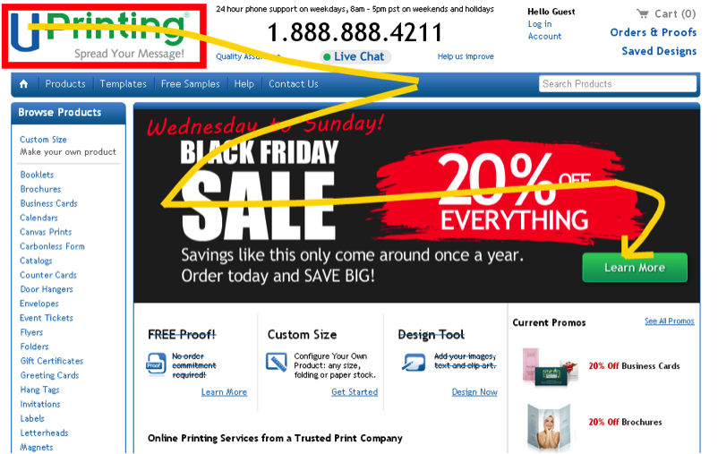
Now that we have an overview of the design elements, let's put them into practice and see how we can use them to, firstly, guide visitors' thought sequences; and secondly, focus the attention of visitors to achieve their—and your—objectives, while giving them the best user experience they could ask for. As a note, I cherry-picked these example sites from different niches so we can learn how they applied the elements of design to serve a better user experience. The design elements in practice1. Emphasize the most important objectiveLet's take a look at what UPrinting.com did for their Black Friday campaign. UPrinting is one of the top printing companies in the US. Let's see how they used the design elements here. SizeSince it was Black Friday, the designers put the biggest banner in front of the site's visitors. Look at the size of the word “sale”; they also used the number 20% to emphasize their main objective. ShapeThey used a rectangle to identify the banner ad. Notice also the green button, which led visitors to a page where the offers were, and where interested people can learn more about the sale. ColorI really like the way they used color contrast here. A black background was aligned with the theme, Black Friday. Then they used the contrasting color of white to emphasize the word “sale”. Finally, the use of red behind the words "20% off everything" automatically drives our eyes to this message, and eventually to the green Learn more button. Why use green instead of the usual red or orange? This might signal to users that clicking the button is safe to do, and that there's more on the next page. Green is also the color of their logo at the upper left hand corner. The subliminal message here—that when I click on that button, I will find things that are about printing and learn more about the promo—is very clever. PositionObviously, this ad is above the fold. But the position of the green button does not distract from the other messages in the banner. It's at a spot where, after your eyes have scanned the whole message about the sale, you will naturally end up. So here's how the thought sequences are answered in this page:
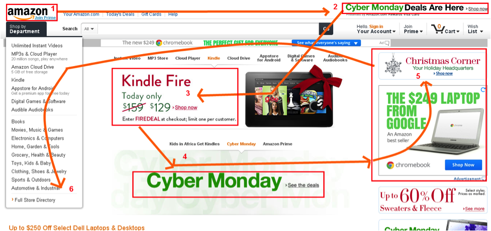
2. Use just the right number of design elementsLet's take a look at what Amazon did for their Cyber Monday promotion. Amazon is the largest online retail store in the world—they could really give us some great lessons in design.
3. Make effective use of balanceSEOMoz is one of the most prominent organizations in the SEO and inbound marketing community. Let's look at what they do with balance.
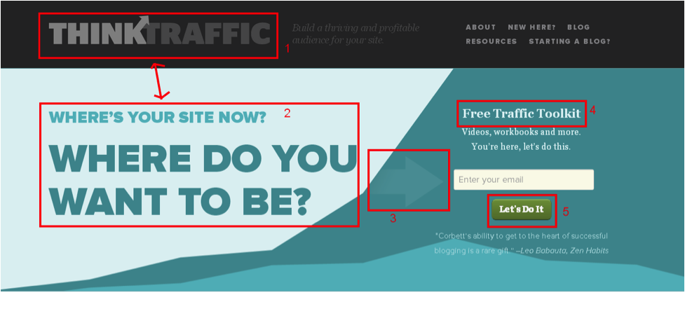
4. Communicate the right messages effectivelyLet's analyze the how ThinkTraffic.net communicates its key messages about attracting traffic.
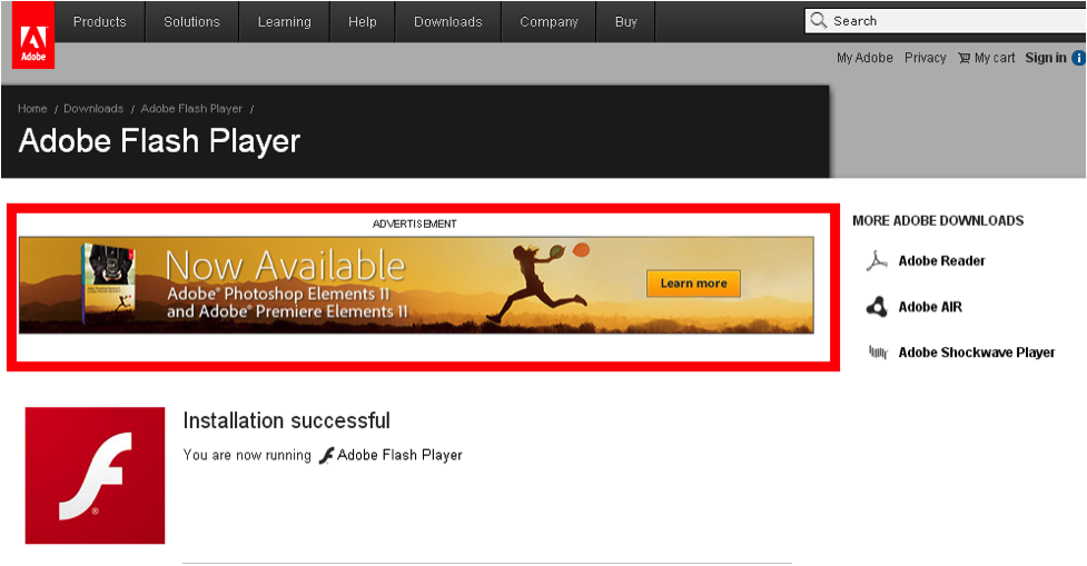
5. Use the right flowRecently I updated Adobe Flash Player and after everything was done, I was redirected to an installation success page that contains a banner for Adobe‘s newest Photoshop Elements packages. Let's take a look.
Are you using the design elements on your blog?When you work on your blog’s design, don't just optimize it for search engines or for a fashionable design. Think of how you can best serve your visitors by giving them the best user experience. You can do this by guiding them through the sequence of their own thoughts. This approach builds trust in your site and helps you communicate your message clearly, which supports higher conversions. People buy from people. Talk to your users through these design elements. Do you have other ideas you can share based on the examples I've mentioned here? +Mark Acsay III is an online marketing consultant, the owner of Webby Thoughts blog that talks about inbound marketing topics. Originally at: Blog Tips at ProBlogger Use These 5 Design Elements to Create the Optimum Blog User Experience |
| My 10-in-1 Content Creation Strategy [Case Study] Posted: 17 Jan 2013 06:02 AM PST This guest post is by Wayne Turner of MurrayKilgour.Com. Content creation calendars and schedules are the bane of most serious bloggers' and content managers' lives, depending on which side of the creative block you’re on. I straddled this fine line on many occasions until my Eureka moment. Having amalgamated my home radio and video studios I realised that I could double up on content creation with my business-consultant partner, a content reservoir of genius proportions. Soon we had discovered a 3-in-1, then a 6-in-1, and finally a 10-in-1 content creation strategy. When I say “radio and video studio” (actually my third bedroom), be assured it’s not exactly state of the art, although I have slowly acquired suitable equipment and created a workable dual studio. In saying this, anyone with a computer, some sort of USB audio interface/mixer, a reasonable microphone and digital video camera or DSLR can achieve the same results. In this article I assume you are familiar with your gear so I'm not going to go into any detail on how to use each piece of equipment in the process. Time costs!One of the most valuable, and rarest assets of a successful business consultant is time. To maximise the genius of my partner, when time is in such short supply, is a hectic operation usually resulting in a minimal flow of great content. This is where my Eureka moment has paid incredible dividends and saved many hours in the generation of multiple pieces of content at once. Because we use a joint audio and video, green-screen studio, when we sit down and record a session, we create both an audio and a video recording simultaneously. The following ten points outline the quality content that we create from each five-minute recording session. We now have this down to such a fine art that we can do six, five-minute recordings in 40 minutes. For me as the content creator, this is heaven, as it enables me to work in my genius. (A little side note here: your genius is simply working in your passion and talent, and I believe you need to be doing this for 80% of your working time.) How it worksSo, it all starts with one content creation session—just one!—where we have learned to maximise both time and genius. Of course there is preparation required to make the session go smoothly, and a good knowledge of your field of expertise is essential, but once we’re in studio, this is how the magic happens.
Ten points sounds good, and I thought that adding an eleventh point might be a bit much, but here’s a bonus idea. What we’ve done is created a boxed DVD set for offline and online sales as training modules. Not all people are excited about online, and some like a physical product in their hands. In our business we use all of the above content in its different forms as part of a DVD boxed series for sale to our coaching clients. They love it and we love it—especially the time it takes to create! Unlimited contentThere are no limits to how you can use your content if you begin with the end in mind, but the emphasis must be on quality content. When you sit down in front of the camera and microphone, think "end product," and design your process to get the most out of the content creation session. I’m sure that most people can easily create seven of these ten pieces of content out of just one five-, ten-, or even 30-minute recording session. So, think big in your content creation, begin with the end in mind, and maximize your time and effort to produce content that will attract the best traffic and convert those people into buyers. Your success will result from the quality of content you produce. So give it your best! Wayne Turner is a multimedia strategist specialising in photography, radio and video at MurrayKilgour.Com. If you'd like to go to your next level in life and business by working in your genius you can sign up for our free ebook, Living on Purpose. Originally at: Blog Tips at ProBlogger My 10-in-1 Content Creation Strategy [Case Study] |
| You are subscribed to email updates from @ProBlogger To stop receiving these emails, you may unsubscribe now. | Email delivery powered by Google |
| Google Inc., 20 West Kinzie, Chicago IL USA 60610 | |





.jpg)
0 comments:
Post a Comment